
In today’s digital landscape, mobile devices like smartphones and tablets have become the primary means for users to access the internet and conduct searches. With the rapid growth in mobile usage, it’s vital for website owners and marketers to prioritize mobile SEO to ensure their online presence reaches the ever-expanding mobile audience. In this comprehensive guide, we’ll delve into the world of mobile SEO, covering everything from setting up a mobile version of your site to optimizing content and implementing best practices for mobile search success.
Understanding the Importance of Mobile SEO

Mobile SEO is the process of optimizing a website for mobile devices to enhance user experience, improve search rankings, and drive organic traffic from mobile searches. As mobile searches continue to surpass desktop searches, website owners must recognize the significance of catering to mobile users’ needs. In fact, over 60% of organic search visits now come from mobile devices, and Google’s mobile-first indexing makes it clear that mobile optimization is a must for staying relevant in search results.
Setting Up a Mobile-Friendly Website

The first step towards mobile SEO success is creating a mobile-friendly website. There are three common methods to achieve this: responsive design, dynamic serving, and separate URLs. Of these, responsive design is often recommended as it allows the same HTML code to be served to both mobile and desktop users. The website’s CSS then adjusts the layout based on the device, ensuring a seamless experience for users on any screen size.
Optimizing Mobile Site Design and Content

When optimizing a website for mobile devices, it’s essential to consider design and content elements that contribute to a positive user experience. Short paragraphs, skimmable content, and concise introductions are vital for readability on smaller screens. Using white space effectively and avoiding intrusive pop-ups will further enhance the user experience.
Implementing Structured Data for Mobile SERPs

Structured data, implemented through schema markup, can enhance how your content appears in search engine results pages (SERPs) on both desktop and mobile devices. Rich snippets, which display additional information like star ratings and reviews, make your listings stand out and increase click-through rates (CTR) on mobile search results.
Targeting Voice Search-Friendly Keywords
With the rise of voice assistants, voice search is becoming increasingly popular. Users’ voice queries tend to be more conversational and question-based. To optimize for voice search, target long-tail keywords with a natural language approach and focus on answering common questions related to your content.
Ensuring Mobile Site Speed for Better User Experience
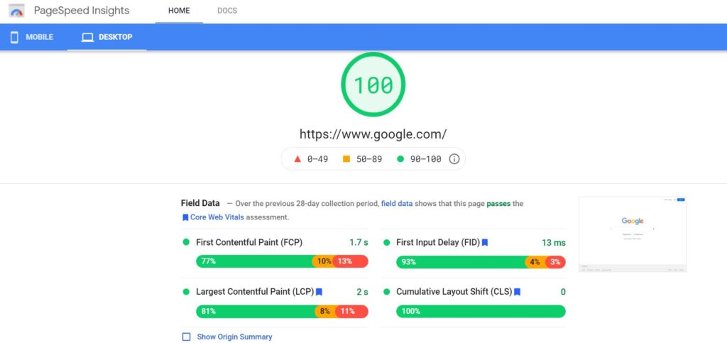
Mobile site speed is a critical factor for both user experience and search engine rankings. Slow-loading pages frustrate users and lead to high bounce rates. Use tools like PageSpeed Insights to analyze your mobile site’s performance and identify areas for improvement. Compressing images, enabling browser caching, and minimizing code can significantly enhance page load times.
Optimizing Title Tags and Meta Descriptions for Mobile SERPs
Title tags and meta descriptions play a vital role in attracting users to click on your search results. Keep title tags under 60 characters and meta descriptions under 120 characters to ensure they are fully displayed on mobile devices. Front-load important information and include a call-to-action to encourage clicks.
Monitoring Mobile Rankings with Position Tracking

To track your mobile SEO performance effectively, set up a Position Tracking campaign with a focus on mobile rankings. Compare mobile vs. desktop traffic for your tracked keywords to identify potential areas for improvement and optimize your content accordingly.
Reviewing Competitors’ Mobile SEO Performance
Staying ahead in mobile SEO requires keeping an eye on your competitors. Use tools like Semrush’s Organic Research to analyze competitors’ best keywords, position changes, and overall performance. Identify keyword opportunities and leverage insights to fine-tune your mobile SEO strategy.
Comparing Desktop vs. Mobile Site Performance
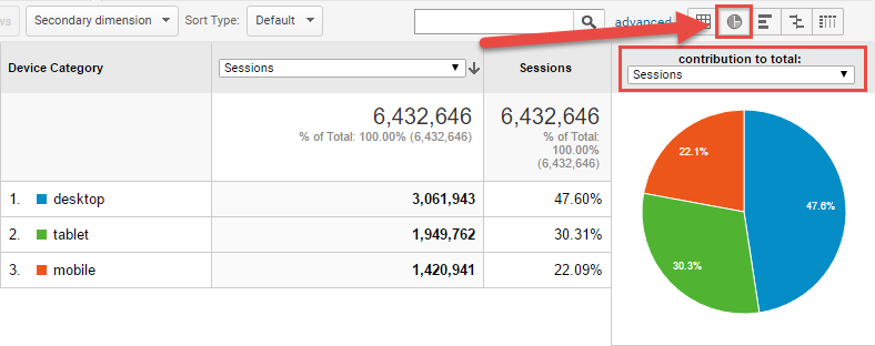
Google Analytics provides valuable data on how your pages perform on desktop and mobile devices. Use the Behavior > Site Content > Landing Pages report to compare mobile and desktop traffic for each page. Identify pages with a significant difference in traffic and optimize them for a better mobile experience.
Emphasizing Local and Voice Search Optimization
As mobile users often conduct searches with local intent, optimizing for local search is crucial for businesses targeting a local audience. Utilize location-based keywords, create a Google Business Profile, and encourage positive customer reviews to improve your local search visibility. These efforts also enhance your presence in voice search results, as voice assistants often rely on local information for queries.
Making the First Scroll Count

Mobile users often make quick decisions based on what they see in the first scroll of a website. Optimize this initial view by presenting eye-catching titles, navigation menus, search bars, and call-to-action buttons. Incorporate interactive elements and floating CTAs to engage users immediately.
Creating Attractive Search Results
With infinite scrolling on mobile SERPs, it’s crucial to make your search results stand out to grab users’ attention. Use the right keywords and power words to create enticing titles and descriptions that evoke curiosity and encourage clicks.
Creating Mobile-Friendly Content
Content is the heart of any SEO strategy, and mobile SEO is no exception. When crafting content for mobile users, keep it concise and easy to digest. Use bullet points, lists, and short paragraphs to make information scannable. Additionally, use engaging multimedia elements like images, videos, and infographics to enhance user experience and keep visitors engaged.
Optimizing Images for Mobile Devices

Images play a crucial role in mobile SEO, as they can significantly impact page load times. To optimize images for mobile devices, compress them without compromising quality. Use responsive image tags to ensure images scale appropriately based on the device’s screen size. Additionally, consider lazy loading, a technique that loads images as users scroll down the page, reducing initial load times.
Mobile Site Navigation and User Experience

Mobile site navigation should be intuitive and user-friendly. Implement a hamburger menu or a simple, easy-to-access navigation bar to guide users through your site effortlessly. Avoid using drop-down menus, as they can be difficult to navigate on smaller screens. Test your site’s navigation on various devices to ensure a seamless experience for all users.
Mobile-Specific Content and Call-to-Action
Consider creating mobile-specific content that caters to the unique needs and preferences of mobile users. For instance, mobile users may be more interested in finding local information or accessing quick answers to their queries. Tailor your content to provide value and address mobile users’ specific search intent.
Similarly, optimize your call-to-action (CTA) buttons for mobile devices. Ensure they are large enough to be easily tapped with a finger, and position them strategically within the content to drive conversions.
Utilizing Mobile Accelerated Pages (AMP)
Google’s Accelerated Mobile Pages (AMP) is a framework that allows webmasters to create lightweight and fast-loading pages for mobile devices. By implementing AMP, your pages are likely to load faster, leading to improved user experience and potentially higher rankings in mobile search results. Consider implementing AMP for critical pages like blog posts, news articles, and landing pages.
Optimizing Local SEO for Mobile Users
For businesses with a physical presence, local SEO is essential for attracting mobile users looking for nearby products and services. To optimize local SEO, claim and verify your Google My Business listing, ensuring that your business’s name, address, and phone number (NAP) are accurate and consistent across all online directories.
Encourage customers to leave reviews on your Google Business Profile, as positive reviews can enhance your local search visibility. Additionally, use location-specific keywords in your content and metadata to increase the likelihood of appearing in local search results.
Conducting Mobile Usability Testing
Regularly conduct mobile usability testing to identify any issues that may impact user experience. Test your website on various devices, screen sizes, and operating systems to ensure compatibility. Pay attention to page load times, broken links, and any issues with site navigation or functionality. Usability testing can help you uncover areas for improvement and optimize your site for a seamless mobile experience.
Mobile SEO and Social Media Integration

Social media plays a significant role in driving mobile traffic to your website. Ensure that your social media profiles are optimized for mobile users, with clear branding and easy-to-navigate links. Share mobile-friendly content on your social media platforms and engage with your audience through mobile-friendly responses.
Leveraging Mobile Local Search Advertising
Mobile advertising presents a unique opportunity to reach mobile users actively searching for local products and services. Consider leveraging mobile local search advertising through platforms like Google Ads and Facebook Ads. Utilize location-based targeting to reach users in specific geographic areas and optimize ad copy and landing pages for mobile users.
Conclusion
Mobile SEO is not just a trend but a fundamental aspect of digital marketing in the mobile-first era. As mobile usage continues to rise, optimizing your website for mobile devices is crucial for staying competitive and attracting a broader audience. From responsive design to mobile-specific content and local SEO, the strategies outlined in this guide will help you create a seamless mobile experience that delights users and boosts your search rankings.
Embrace the power of mobile SEO, and watch your website’s visibility and traffic soar. Regularly monitor your mobile performance, stay informed about mobile trends and algorithm updates, and adapt your strategy accordingly. By focusing on user experience, mobile-friendliness, and local relevance, you can create a mobile SEO strategy that drives results and positions your website for success in the mobile-first world. Remember, the key to mobile SEO success lies in understanding your audience, providing valuable content, and optimizing for the unique needs of mobile users. So, don’t delay, start optimizing your website for mobile devices today and reap the rewards of a mobile-friendly and user-centric digital presence.


